Front-Lit vs Halo-Lit Signs

Front-Lit vs Halo-Lit Signs

Front-lit signage illuminates the visible face, while halo lighting directs light towards a surface behind the sign. The choice affects where the bright area appears and how the lettering relates to its background. Compare daytime appearance and illuminated contrast together, using the actual wall colour and the intended viewing distance as part of the brief.

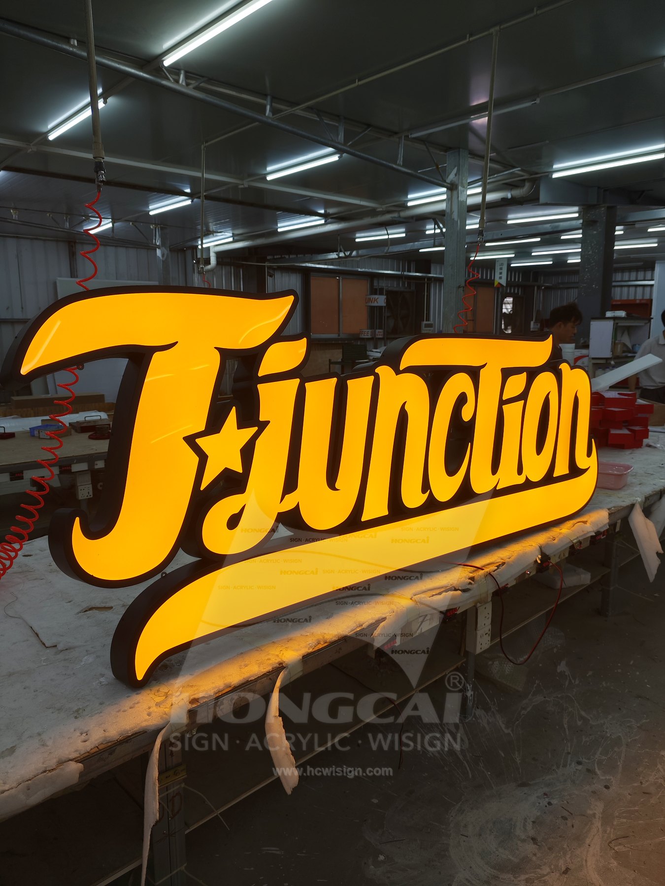
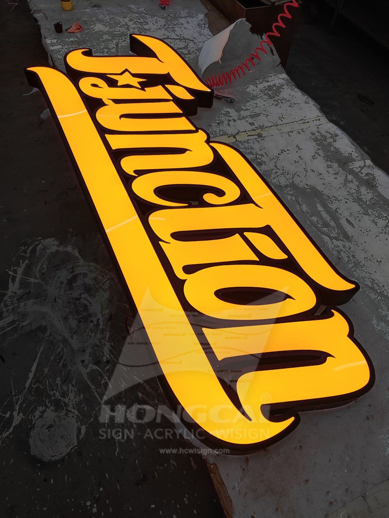
Function warm gold-coloured script illuminated in the workshop.

Compare the Sign Formats

Illuminated Front Faces

A lit front face puts the bright area inside the letterform. It can support a clear name against a darker setting, but fine strokes and enclosed gaps still need review. Compare face colour, outline contrast and the proposed lighting using the actual logo artwork.

View photographed examples

Rear-Directed Halo

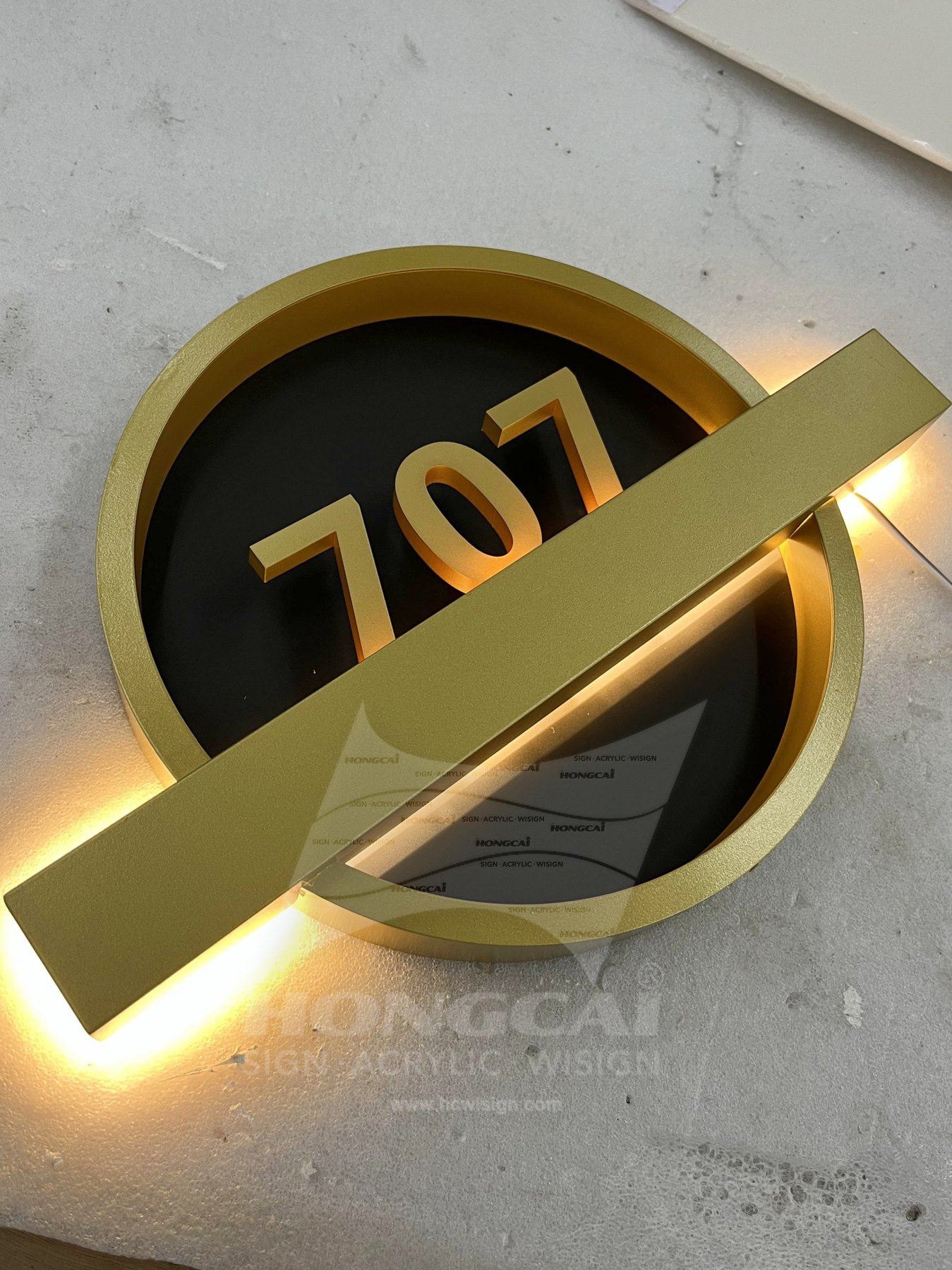
Halo lighting depends on a receiving surface behind the sign. Wall colour, texture and the stand-off arrangement change the visible effect, so the background belongs in the approval sample. A gold-coloured face alone does not identify a sign as backlit or establish its internal construction.

View photographed examples

Full-Body Illumination

Full-body acrylic illumination provides another direction when the face and sides should read as a glowing object. Compare it separately from a halo effect: light from the body and light reflected from a rear surface create different relationships with the surrounding wall.

View photographed examples

Plan the Artwork and Site Conditions

Review the artwork alongside the intended location. A sign that looks balanced in a close-up photograph may need a different letter size, mounting position or light treatment when viewed from the actual approach.

Wall and Stand-Off

Provide the actual wall finish and colour. For a halo proposal, review the distance from the receiving surface and any obstructions behind the sign, because the reflected light is part of the visible design.

Letterform and Contrast

Compare lit and unlit appearance with the final artwork. Check small lettering, fine strokes and internal spaces, considering whether the desired recognition comes primarily from a bright face, a dark silhouette or a reflected outline.

Power and Access

Define lighting components, connection positions and service access for either approach. Agree these alongside the mounting arrangement, so the selected visual effect can be maintained after installation without relying on assumptions from a reference photograph.
Prepare a Custom Sign Inquiry

Attach the photographic reference you prefer and mark the lettering, colour and illuminated areas you want to retain. Include the information below so the proposal can address the complete sign, its supports and connection requirements together.

Discuss a Custom Sign
  • Complete wording, logo and editable vector artwork, identifying every language version and any fixed brand proportions.
  • Target dimensions, quantity, location photographs and available space, including a wider view of the surroundings.
  • Preferred material and lighting effect, mounting substrate, fixing conditions, power position and delivery destination.