
PROJECT IMAGE SET
Interior Signs with 304 Stainless Steel Braille Studs
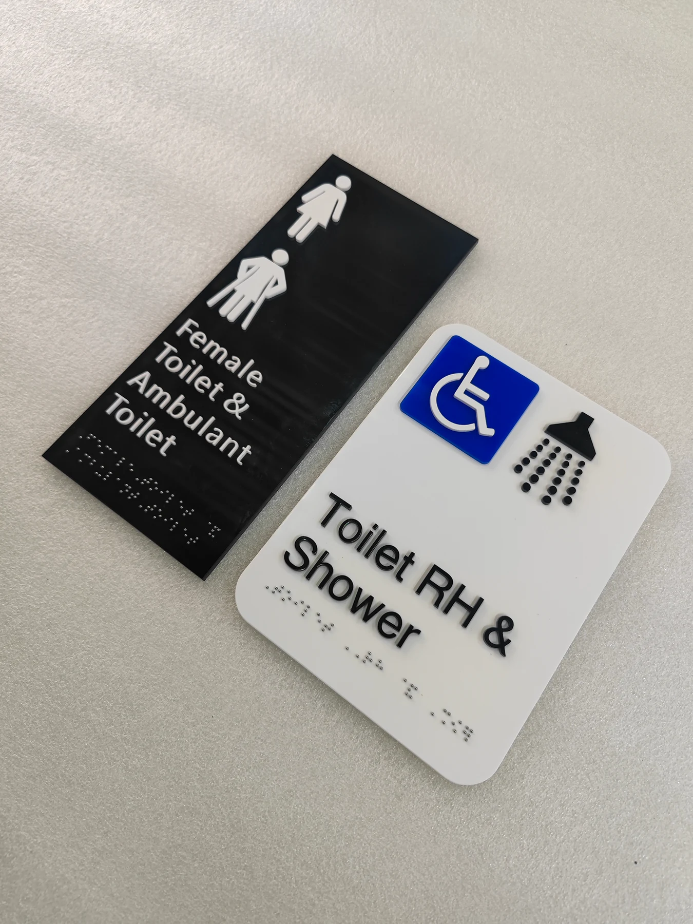
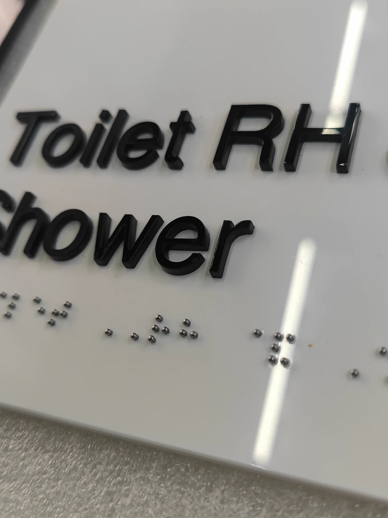
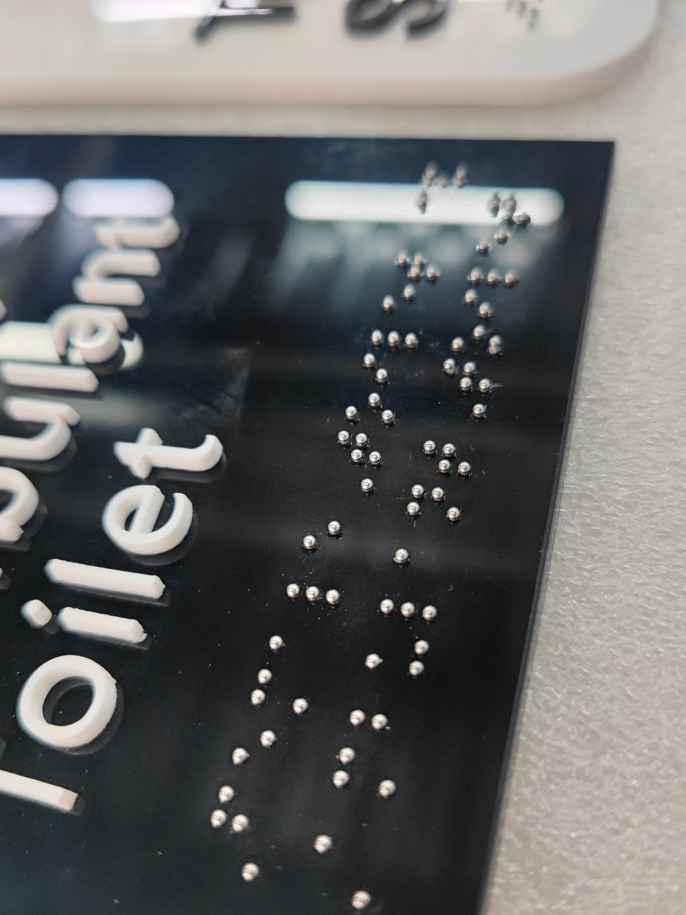
Finished black and white acrylic sign samples combine raised text and facility icons with silver 304 stainless steel Braille studs; the white sample has rounded corners.
Project Images
These project images document different angles and details for reviewing visible proportions, appearance, and context.
KEEP EXPLORING
Explore three more cases in this category
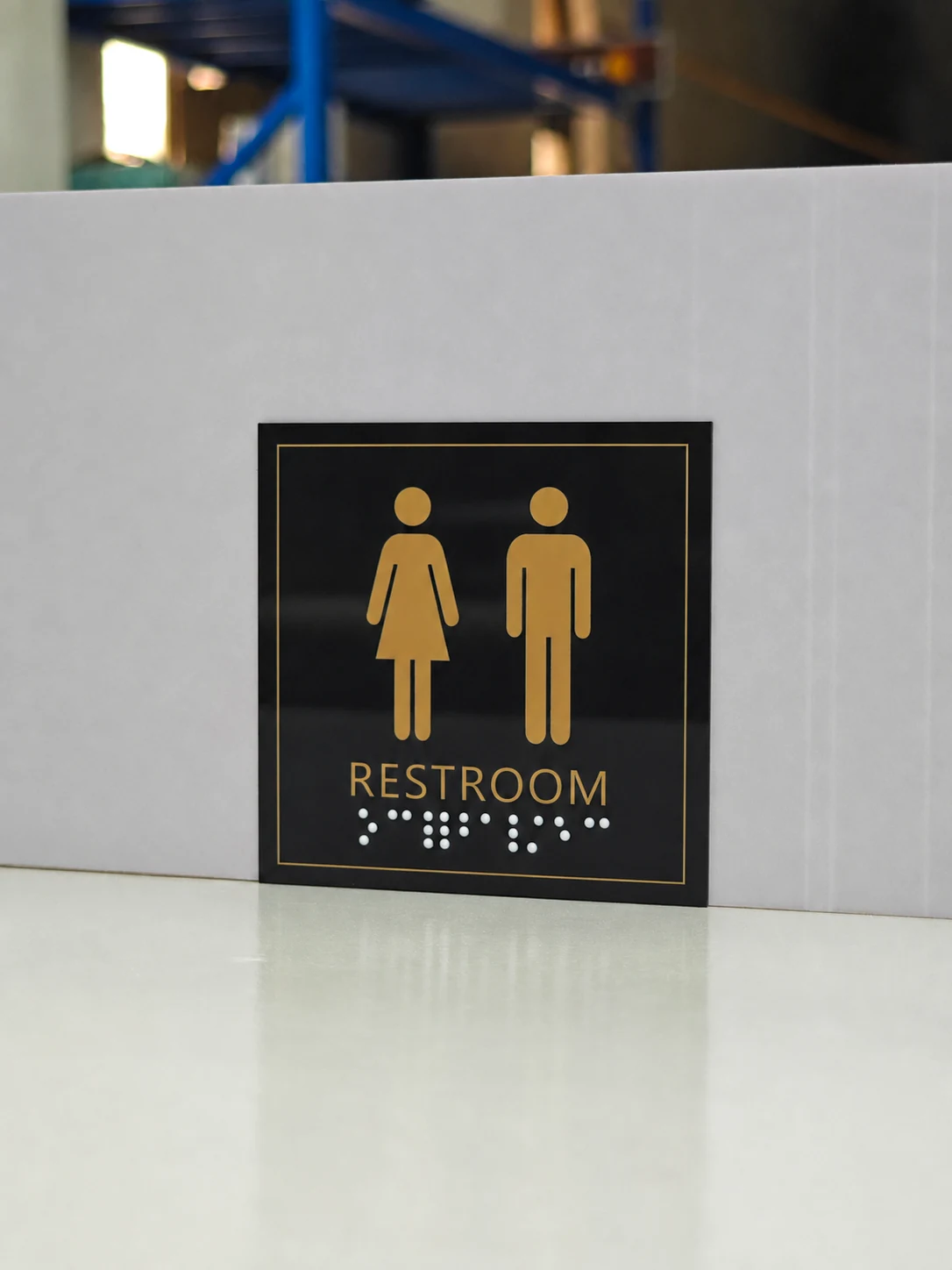
Black and Gold Resin Braille Restroom Sign
A black square panel contrasts gold male and female icons, raised RESTROOM lettering, and white tactile dots within a fine gold border.
Suitable for interior restroom identification in hotels, commercial spaces, and public facilities; dimensions, dot placement, contrast, installation, and applicable standards should be confirmed against approved drawings and project requirements.View Project Details
EMPLOYEES ONLY Resin Tactile Sign
A horizontal black panel uses raised white EMPLOYEES ONLY lettering with white tactile dots below, framed by clean straight edges.
Suitable for identifying interior staff-only areas in offices, service zones, and commercial spaces; dimensions, dot placement, contrast, installation, and applicable standards should be confirmed against approved drawings and project requirements.View Project Details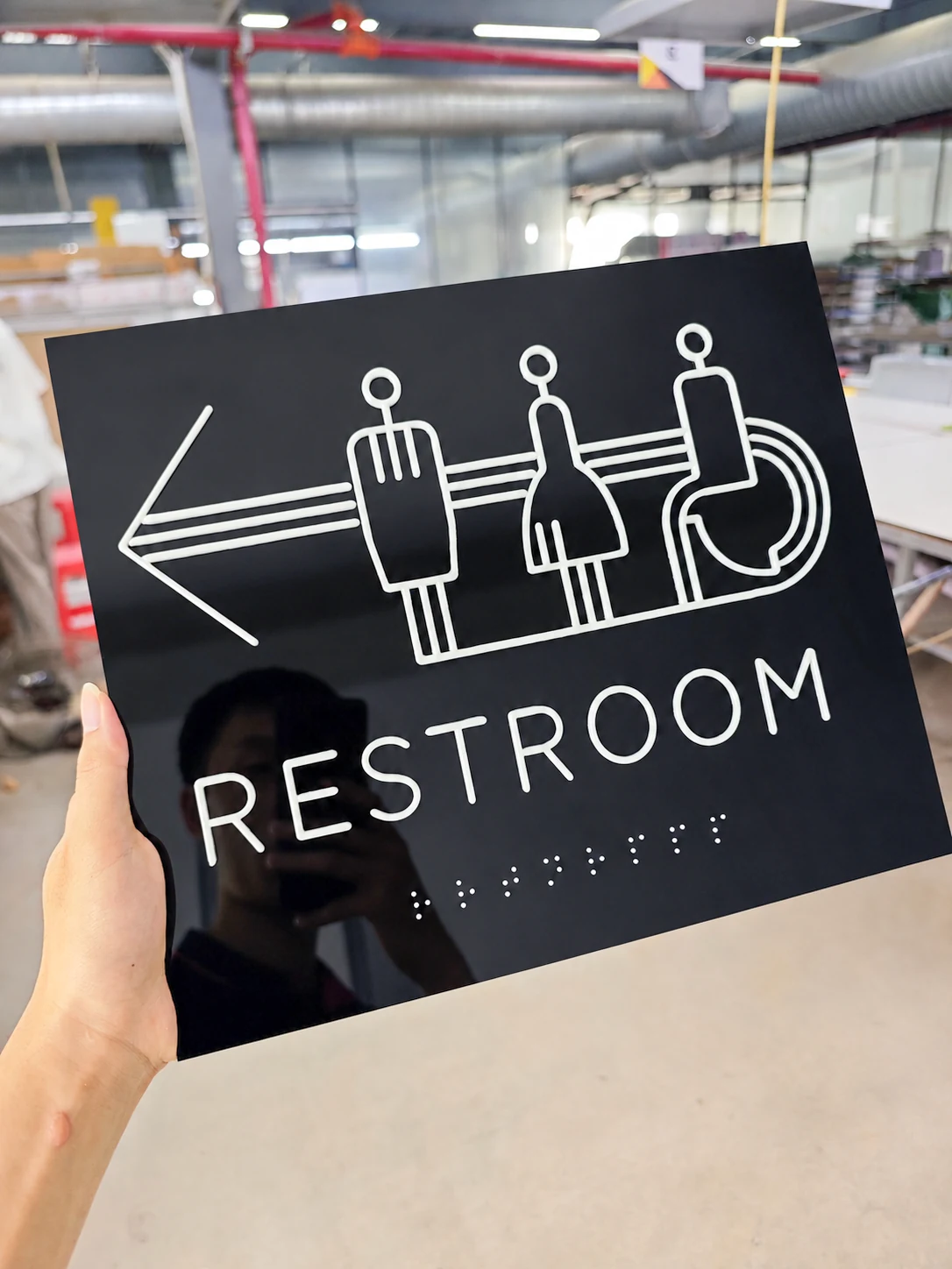
Accessible Restroom Directional Tactile Sign
A black square panel combines a white left arrow, three person and wheelchair graphics, raised RESTROOM lettering, and white tactile dots to present direction and facility information.
Suitable for interior accessible-restroom wayfinding in hotels, commercial spaces, and public facilities; dimensions, dot placement, contrast, installation, and applicable standards should be confirmed against approved drawings and project requirements.View Project DetailsPROJECT GUIDANCE
Interior Signs with 304 Stainless Steel Braille Studs project overview
This case shows a square-cornered black sample and a rounded white sample, both combining raised text, facility icons, and silver 304 stainless steel Braille studs. A comparable project should confirm language, Braille copy, stud placement, character height, contrast, edges, mounting height, and quantity against the applicable standard and approved drawing.
Design and fabrication highlights
- Black and white panels compare square and rounded edge choices
- Raised text and facility icons provide visual and tactile information
- Silver 304 stainless steel Braille studs contrast with the panel finishes
Two panel options with tactile information
The white sample uses rounded edges, raised black text, and multiple facility icons; the black sample uses a straight-edged outline with raised white text. Both use silver Braille studs, allowing review of color, edge, and information hierarchy.
Standards inputs come before production dimensions
Provide the national or project standard, installation country and facility, exact text and Braille copy, icons, panel dimensions, colors, edge format, mounting method, quantity, and sign schedule. The supplier can then prepare drawings for review rather than treating a generic sample as project compliance approval.
Inspect tactile information against the approved drawing
Finished-sign checks should verify wording, icons, Braille stud positions, completeness of raised elements, color contrast, edges, and quantity. Mounting height and location remain subject to project acceptance under the applicable standard.
Frequently asked questions
When are 304 stainless steel Braille studs a suitable design choice?
They suit schemes requiring a metallic tactile finish, durable touchpoints, and clear contrast with the panel. Final stud placement and dimensions follow the applicable standard.
How do the white and black samples differ?
The white sample has rounded edges, raised black text, and multiple facility icons; the black sample has straight edges and raised white text.
Which standards information is needed for a Braille-sign quotation?
Provide installation country and facility, applicable standard, exact text and Braille copy, icons, dimensions, mounting height, quantity, and sign schedule.