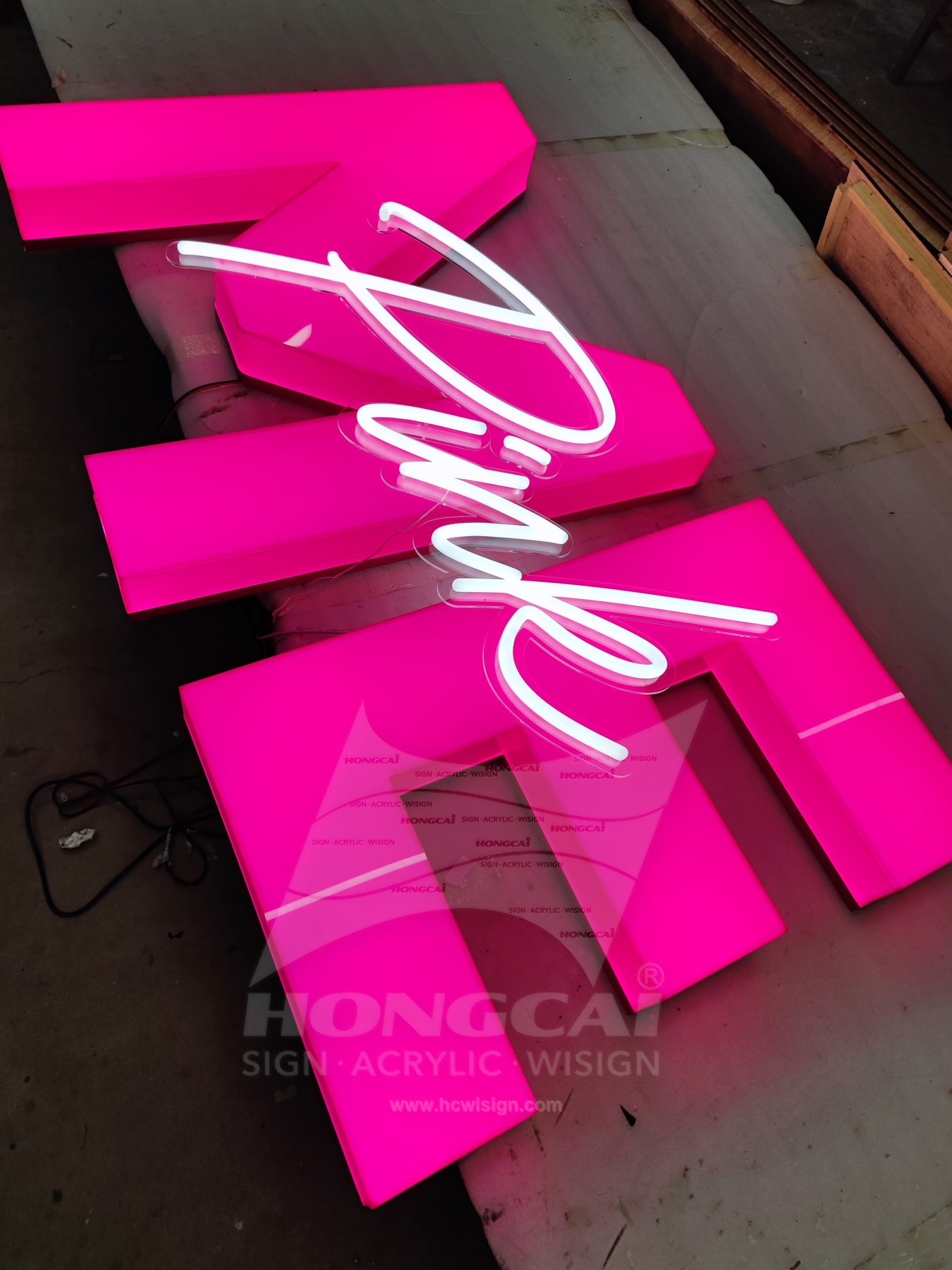
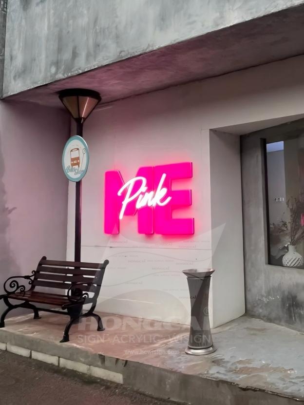
Review the artwork alongside the intended location. A sign that looks balanced in a close-up photograph may need a different letter size, mounting position or light treatment when viewed from the actual approach.
Preserve the Logo
Supply the final vector logo and identify joined strokes, thin details and intentional overlaps. Review those features at the proposed sign size, so fabrication choices preserve the approved logo rather than replacing it with a similar-looking script.
Reception and Photo Background
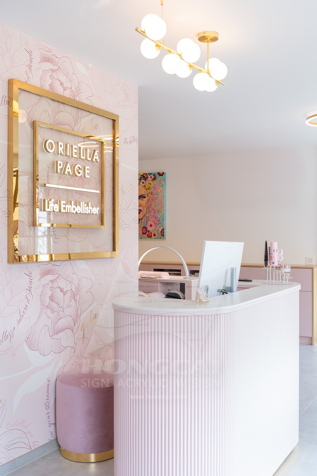
Show the reception counter, wall finish and likely standing position if the sign also appears in customer photographs. Consider the background and surrounding lighting together, keeping the name visible without letting the illuminated area dominate the entire scene.
Lit and Unlit Appearance
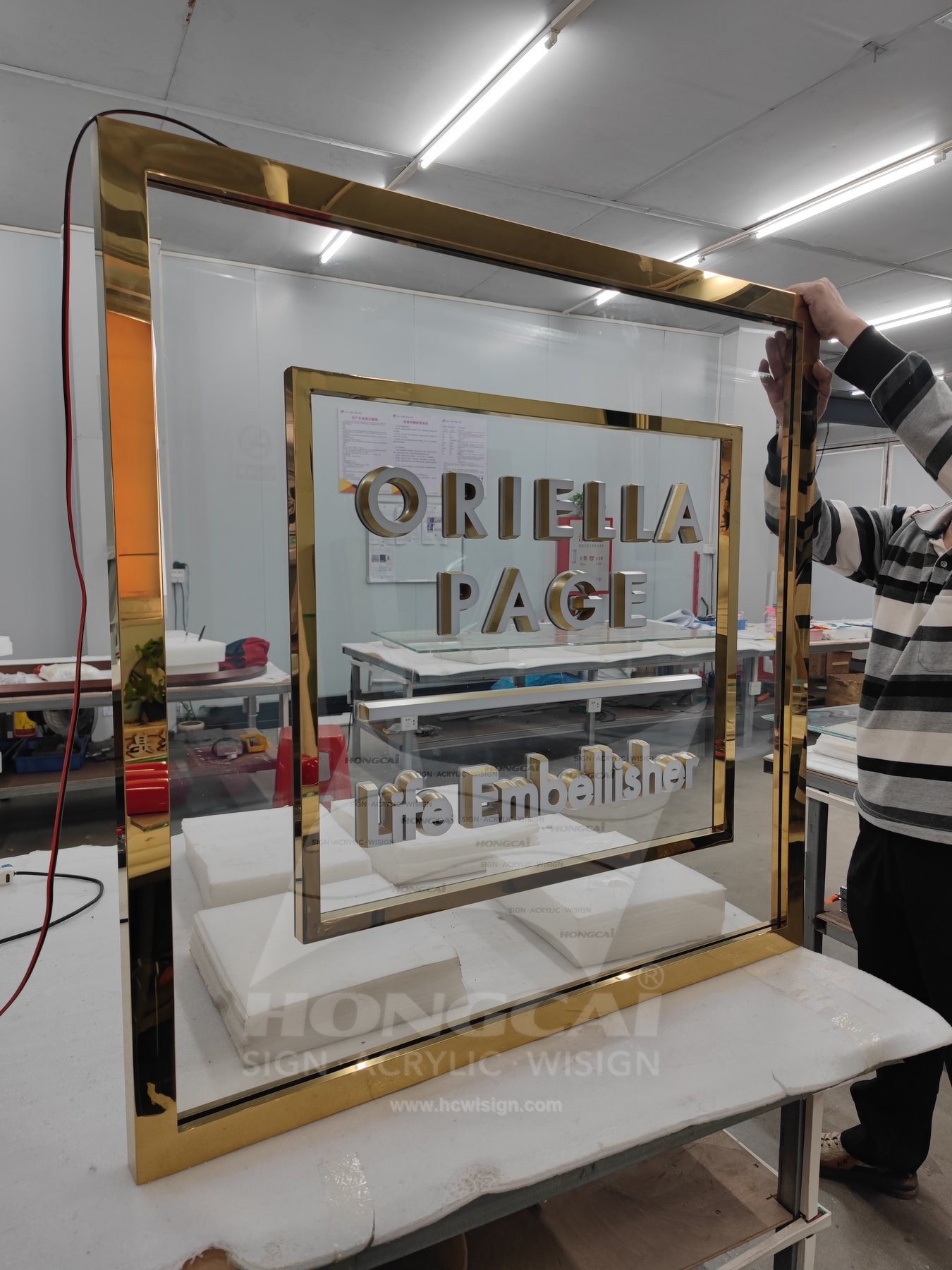
Approve colour in the normal room lighting as well as the illuminated effect. Identify switching, power entry and maintenance access, especially where lettering sits above furniture or where a framed sign needs clearance from the wall.