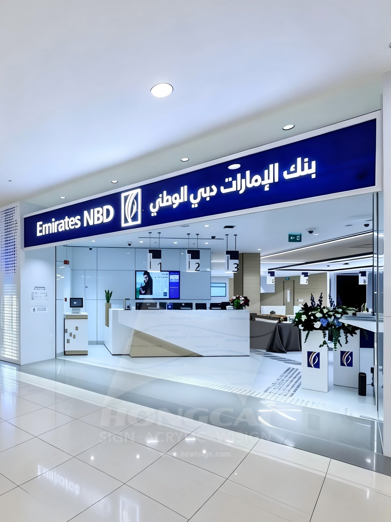
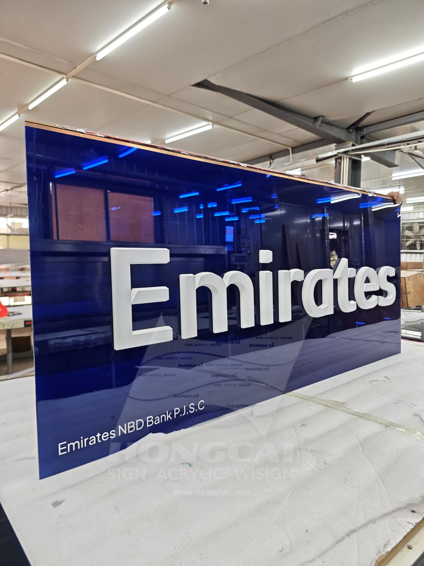
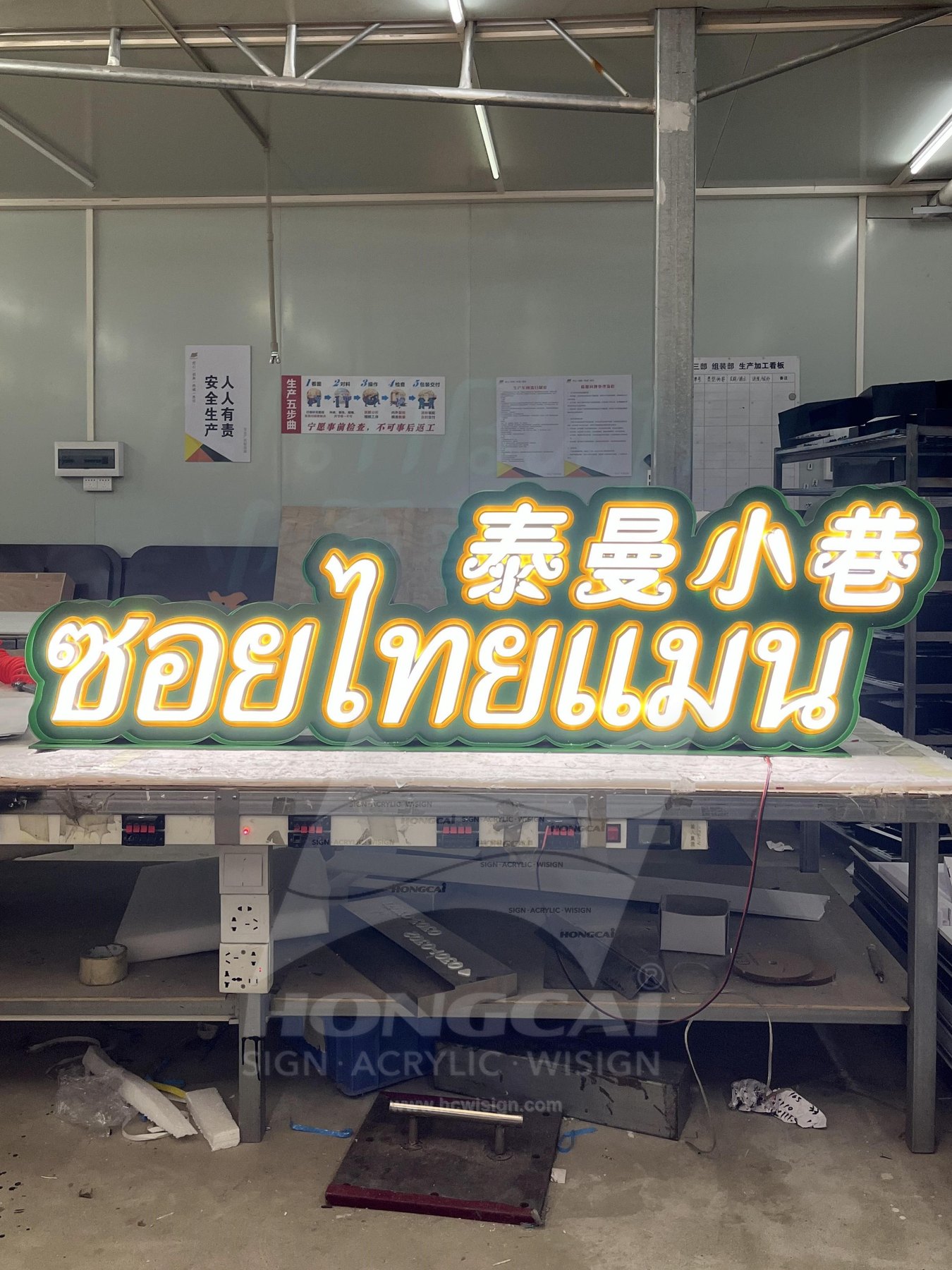
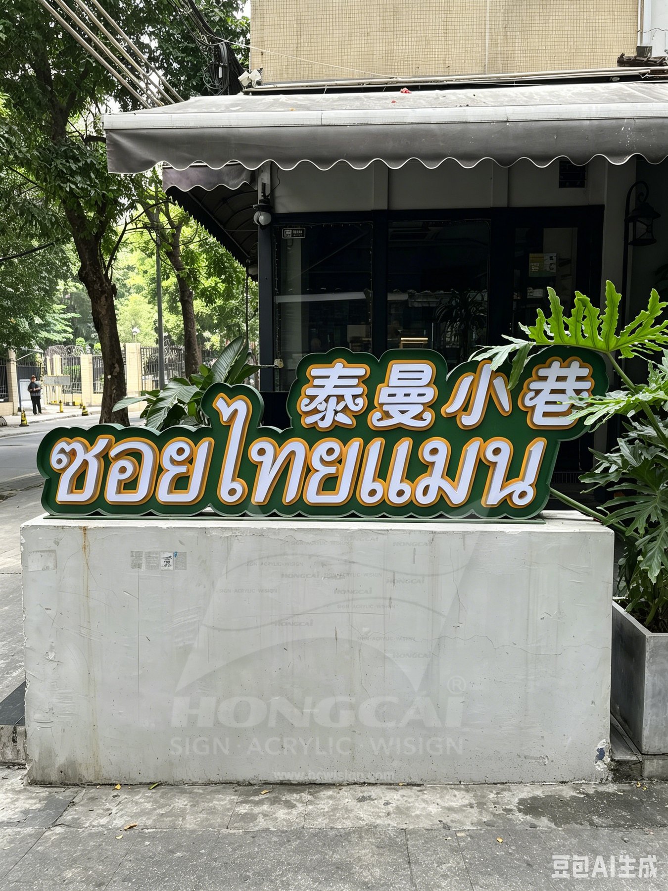
Review the artwork alongside the intended location. A sign that looks balanced in a close-up photograph may need a different letter size, mounting position or light treatment when viewed from the actual approach.
Line-by-Line Approval
Have a reader of each language approve spelling, direction, joined forms and punctuation. Preserve an approved outlined vector file so the letterforms used for fabrication match the wording and typography reviewed by the customer.
Reading Order
Explain where the audience approaches from and which line should lead. Compare the complete composition at that distance, allowing the second language enough space to remain useful rather than judging balance from letter height alone.
Detail and Illumination
Identify fine strokes, enclosed spaces and colour changes in the artwork. Review how the proposed lighting affects those details so illumination supports the correct reading of each script instead of merging small gaps.